


While market commentators continue to debate the shape of economic recovery, a quick glance at an S&P 500 price chart confirms the V-shaped recovery investors have enjoyed since the dark days of late March.

George Hosfield, CFA, discusses Ferguson Wellman's quarterly strategy titled, "Inflation's Flame Flickers," which addresses the narrow market leadership, the impact of higher interest rates on inflation and how assets are priced at this stage of the economic cycle.
George Hosfield, CFA, discusses the firm's quarterly strategy titled "Stalemate," which highlights the Fed's ongoing battle to tame inflation along with our views on the health of the banking industry and capital market expectations for the balance of the year.
Director and Chief Investment Officer George Hosfield, CFA, discusses the Fed raising interest rates, peaking inflation and our view on equities and volatility across all asset classes in our Investment Strategy titled, “Balancing Act.”
While market commentators continue to debate the shape of economic recovery, a quick glance at an S&P 500 price chart confirms the V-shaped recovery investors have enjoyed since the dark days of late March.
All day and every day we are bombarded by economic, company and political news. And not just U.S. news, but global news as well. Even in normal times this can seem overwhelming, and especially so during a pandemic.
This morning, the Bureau of Labor Statistics reported that the U.S. economy added nearly 1.8 million jobs in the month of July, outpacing economist expectations for an addition of 1.5 million.
Economic signals indicate that the recovery has begun around the world. As expected, China has been the first to emerge from recession, and their economy is moving forward.
 by Brad Houle, CFA
Executive Vice President
by Brad Houle, CFA
Executive Vice President
Last week's Fed announcement had something for everyone. The Fed removed the word "patient" from its forecast for increasing interest rates. This is an acknowledgement that the economic recovery is well underway and the strong employment data month-after-month is a confirmation of this fact. Taken in a vacuum, this change in the Fed’s message could be construed as being "hawkish" meaning that the Fed is in a hurry to raise interest rates to keep the economy from overheating. However, the Fed also dropped its own interest rate forecast which could be construed as being "dovish" meaning that the Fed is reluctant to raise interest rates. As a result, there was a strong rally in both the bond and stock markets which is what we mean by something for everyone.
The Fed's interest rate forecast or "Dot Plot" is a relatively new construct from the Fed. There has been a concerted effort to communicate more openly with the markets by the Fed. This endeavor was successful in the Bernanke-era Fed and has also been continued by the Yellen-era Fed. It is pejoratively called "open mouth policy” because what the Fed communicates to the market is ultimately as important as what the Fed actually does.
In the “Dot Plot” each Fed Governor posts their interest rate forecast on a chart which is then released with the minutes of the Fed meetings. Each dot is only one person’s opinion; however, the dots when taken in context, gives investors an idea of what the Fed Governors are thinking. Ultimately, these individuals have the ability to influence when short-term interest rates actually rise. Historically, when short-term interest rates have risen, longer-term interest rates have also climbed. Our research partner Bloomberg has done a good job illustrating what the Fed is trying to communicate with the "Dot Plot."
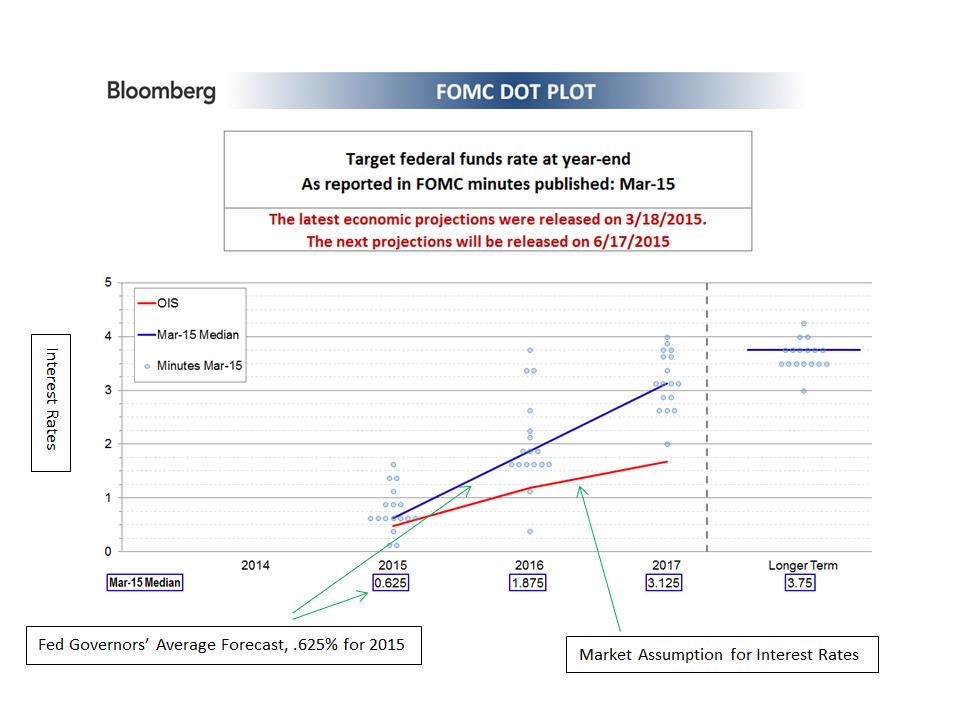
The blue line above represents an average of the Fed Governor’s forecasts for the next three years. These forecasts range from .625 percent for short-term interest rates by the end of 2015 to 3.125 percent by the end of 2017. The red line depicts what the market is discounting for interest rates over the next three years. The market discounts a number of different circumstances - both the Fed raising interest rates and not raising interest rates. This Federal Reserve forecast is assuming that rates are going to be raised. There has been much hand-wringing over when the Fed will actually act. Ultimately, when the Fed actually raises rates is unimportant. The important thing is that the economic growth is robust enough that rates should rise to keep the economy from overheating.
Our Takeaway for the Week:


