by Peter Jones, CFA
Senior Vice President, Equity Research and Portfolio Management
It has been a very challenging year for the capital markets. Not only have stocks entered a bear market, but bonds are on pace to have their worst return in more than a century. Typically, bonds have a negative correlation with stocks and, as such, tend to have strong returns when stocks decline. However, this is the first time in 52 years that stocks and bonds fell in the same year.
While capital market downturns are not fun for anyone, it is important to remind ourselves of the long-term perspective, which undeniably illuminates the merits of investing in the public markets. To spread the holiday cheer ahead of this weekend, we wanted to provide our readers with a couple of charts that illustrate the reward of staying invested for the long term. We hope everyone stays warm for the next few days and has a wonderful holiday season!
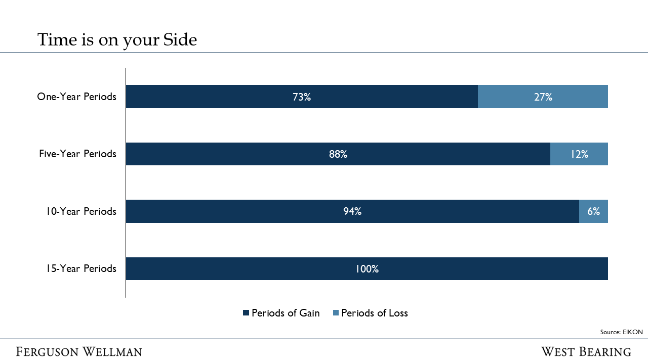
Time is On Your Side
The chart below displays the “odds” of making money in the stock market over different time horizons. Over one-year periods there is about a 73% chance of making money … good, but risky. Past performance is never a guarantee of future returns, but over 15-year periods, the S&P 500 has never failed to provide investors with a positive return.
Source: EIKON
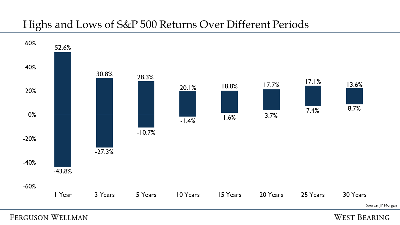
Expanding further on the data above, the chart below shows the highest and lowest returns provided by the S&P 500 over different periods. As is very fresh in all of our minds, one-year periods can be highly volatile … in fact, there is nearly a 100% spread between the single best year and the single worst year.
Alternatively, the spread between best and worst for extended time horizons is narrow and compelling. For example, if an investor bought at the worst possible time but stayed invested for 30 years, they would have had a compounded annual return of 8.7%! $250,000 invested for 30 years at 8.7% grows to more than $3 million.
Source: J.P. Morgan
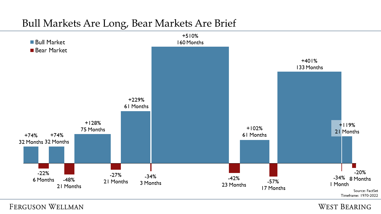
Lastly, the chart below depicts the history of bull markets (blue) and bear markets (red). The width of each bar indicates the length of the expansion or downturn. The height of each bar indicates the magnitude of stock price movements in each cycle. The stock market spends most of its time in a bull market … there is a lot more blue than red. Not only do bull markets make of the majority up time spent in the market, but the magnitude of bull market returns is simply incredible.
Source: FactSet
While historical data isn’t the medicine for losing money, we think it is important to evaluate the current bear market with a long-term perspective. Those that stay invested are generally rewarded; this too shall pass. As investor Peter Lynch once said, “Far more money has been lost by investors trying to anticipate corrections, than lost in the corrections themselves.”
Takeaways for the Week:
This is the first time in 52 years that both stocks and bonds have declined in the same year
Long-term investors are rewarded for staying in the stock market
Bear markets are painful, but they have always come to an end


